Aleksandra Melnikova is an inclusive researcher, service designer, and co-founder of Cosmic Velocity who is passionate about accessibility. Below, she details the process of iterating on a presentation to make it more accessible and shares key takeaways for designers.
* * *
In August 2022, I was so excited to release the Inclusive Research Report—talking about how we make our research more inclusive as a process and a field—that I must say I had not rigorously tested the document itself. My implicit bias took over: I know a thing or two about accessibility, I’ve always written, spoken and cared about it, so I try my best to make anything I create accessible by default.
Our Starting Point for the Inclusive Research Presentation
We designed the presentation in Figma first, but as we had to collaborate extensively, we decided to move to Google Slides for the ease of sharing and editing.
Here’s what we did to make it accessible in the first place:
- We created a clear page structure with descriptive headers
- We used the highly legible Lexend font
- No text was smaller than 13 pt.
- Contrast was checked with this tool throughout
- We did not use excessive images or text overlaying images
Feedback
I received tons of positive feedback from all around the community signaling that the research was useful. There was one comment that stood out for me: “Your report here is inaccessible to read on 20% of pages for any of your audience on neurodivergent spectrum.” It proceeded to list some specifics:
- Bright and contrasting colors and images
- Centre-aligned text
- Heavy blocks of text without enough leading
Oh, this is something I need to iterate on pretty much now, I thought. So, I went back through the document and changed a few things:
Immediate Changes
- Decreasing the level of bright and contrasting colors and images, removing color where not necessary
- Increasing color contrast (for avoidance of doubt, aiming at AAA level)
- Checking if we used center-aligned text for headers only (we did)
- Adding more leading (line spacing) and padding to all presentation components
Then, I thought to myself, I’d love to check it in a more objective way; surely there’s a plugin for this! There was a Chrome plugin called Accessibility checker for Google Slides. Here’s a screenshot of what it enables you to check:

Thank you for the overview, but not helpful, as there’s no way to get to the core of individual issues, and that is in a 95-page deck! More research, unfortunately, revealed that Google Slides simply does not have any decent document accessibility checkers.
I needed three things to understand how might I make the report better:
- Speak with accessibility experts
- A more useful way of checking whether I made real progress, on the “software said yes” level
- Testing with people with dyslexia and autism (at the least)
Expert Opinion: Alt Text, Slide Titles, and Reading Order
James Sheasby Thomas, our very own accessibility specialist, had some excellent points: “Visually, I think the accessibility is very good. From a screen reader perspective, this is not accessible but this is a very high bar to reach for presentations, so I would suggest a companion blog post, podcast or video instead.”
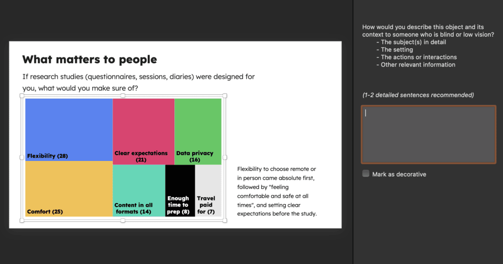
He also flagged a few key rules I needed to ensure I follow—in regards to alt text and how it needs to be written, as well as focus order (the order in which the page gets read out by screen readers):

I manually added missing alt text, James and I were happy about it, but how do I know I haven’t missed anything?
This is where Kay Patel, a wonderful Digital Inclusion and Accessibility Standards Lead at HMRC said, “You need to switch to PowerPoint. They have an excellent accessibility toolkit.”
If it were a movie, this is where sad music would start playing. Like many product/service designers, my relationship with PowerPoint is tense, to say the least. Between Keynote, Pitch and Google Slides it is (was) the last on my list of pleasant presentation software to use. Why, you might ask? I’ll answer with a few screenshots:

I exported my Google Slides to PowerPoint. Then, I reached a good level of desperation trying to log in to Office Suite, getting cryptic messages about my account being view-only, as well as failing to edit a chart and having to re-install the software altogether. However, there was a plus side: the accessibility checker was the best one I’ve seen to date.
Thanks to Kay, I learned how to fix the alt text on the shapes, ensure contrast in a few places I missed, and sort out the order of the page components by working with the Selection Pane. I ran through the report several times until there were no issues left within the accessibility panel on the checker.
She also shared these immensely useful accessibility resources:
- Accessibility Empathy hub by HMRC
- Raising accessibility awareness by HMRC
- Accessibility for Products – a project looking at various barriers, including helpful presentations by BBC
- Magic contrast checker sampling colors by eyedrops tool by TPGi
Kay recommended working on the text-only version to accompany the deck in order for it to raise fewer barriers for people and be more accessible.
Testing
After sharing the amended presentation with a few friends who experience dyslexia and ADHD, I got this feedback: “I like the font, it’s easy on the eye, background color not being stark white is a little more relaxing to read; I like the use of color and copy hierarchy to help me differentiate the sections!”
“Design is iteration. Negative feedback is the best kind you can ever get.”
That’s when I realized I can close the iteration and focus on the next thing I was trying to improve, outside of the report itself.
My Takeaways, Your Takeaways
Here are eight rules I carried out of this experience for accessible presentation design:
- Start in PowerPoint. Save yourself time, it has the most mature accessibility checker applied to the slides in progress. (I hope one day soon Pitch and Google will follow suit with a decent way to check and implement document accessibility.)
- Think purpose! Make sure everything within the page has a purpose and nothing is decorative. Decorative shapes often clutter the experience for those using screen readers.
- Declutter. Look at the page. Declutter again. Leave enough space: margins, padding, leading.
- Left-align copy. The paragraphs are easier to read for people with dyslexia.
- Choose your font wisely. Opt out for a simple font that prioritizes legibility.
- Focus on the sequence. Construct pages as if you were reading them in a sequence. Think about the hierarchy of pages in markup terms (header, image, body), as that is the order that screen readers will read it out in.
- Craft your alt text. Do this for every image except for the ones like headshots where the name is next to the image. PowerPoint has a feature that enables to auto-generate alt text, which is a great start.
- Iterate. Once you’re done, run it through software, and talk to people including accessibility experts and the community.
To Conclude
Design is iteration. Negative feedback is the best kind you can ever get, it will make you better instantly. I treasure it. It made me reconnect with amazing people who have helped me through this process and have numerous accessibility conversations with my team sharing my own learning. I absolutely love how kind and welcoming the accessibility and inclusion community is.
Here goes the report that can now hopefully be enjoyed by many more people!
Author
-
 View all posts
Aleksandra Melnikova, an Inclusive Service and Product Designer with 18 years of experience, has made meaningful contributions at various organizations, including Lycamobile and Poke. Dedicated to creating useful and sustainable products, Aleksandra is committed to fostering happier teams. With a rich background in inclusive design, she drives positive impact in the field. For questions or inquiries, please contact [email protected].

