We’ve all heard the adage before “a picture is worth a thousand words.” With 90% of the information transmitted to the brain visually, it’s no secret data visualization is a powerful tool that organizations virtually in any industry can benefit from. Data visualization is not only a communication tool, but a research tool as well – a combination of technical analytics and storytelling.
Data visualization is where data science meets design. It plays a key role in increasing efficiency and profitability. From faster decision making, to finding trends and patterns, and strengthening communication among the team, organizations that leverage their data visualization are put ahead of the competition.
Quicker Decision Making
People retain 80% of the images they see but only 20% of what they read. That’s why organizations benefit from turning data into a more comprehensible approach. Business leaders and stakeholders can expedite decisions based on the data presented.
Data visualization tells meaningful stories and brings deeper levels of information to the surface. This helps business leaders draw actionable insights in less time and drive value. Data visualization summarizes mass amounts of information in an easy-to-understand format.
With the mass amount of data and the complexity it can bring, data visualization contextualizes it for a better understanding. Using the right data visualization tools allows organizations to move forward and make informed decisions.
Take a look at the two graphs below. Which one is more visually appealing and easily tells a story with the data available?

Source: Resagratia.com
The pie chart has so many “slices”, it becomes a real challenge to tell which area had the longest sum of distance. Additionally, the different colors are not easily differentiable from one another. These are elements to keep in mind that may cause confusion and misunderstanding among the audience.

Source: Resagratia.com
On the other hand, looking at the bar graph, you can immediately see which areas had the longest and shortest distance. Identically, this visually appealing graph allows for accurate and rapid decision making based on the data presented. The bar graph helps you get your point across to the right audience in a comprehensible format.
Find Trends and Patterns
Data visualization can easily identify patterns and anomalies from the data available. Visualizations allow business leaders to quickly recognize trends over time, make predictions and drive decision making. Well-crafted visuals are a powerful tool to interpret data and communicate insights to stakeholders.
Take a look at the graph below. As you can see, it’s comparing the quarterly sales for 2013, 2014 and 2015. Looking at the graph, you can easily spot the trends and patterns. Based on the data presented, each quarter has increased sales from the previous year.
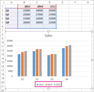
Source: Microsoft.com
Therefore when done correctly, data tells a story that often we cannot put into words. But you have to be careful as there are various bad data visualizations that can lead to misunderstandings with the intended audience. Crafting a compelling narrative enables organizations to spot patterns and respond accordingly.
It’s important that the data is well-designed and presented – from layouts to position, to colors and text. Consequently, it allows stakeholders to digest the data and interpret critical insights that may affect key performance indicators (KPIs).
Enhance Communication
Data visualization allows the information presented to be more digestible. It also fosters better communication and collaboration among team members and stakeholders. Nonetheless, without visualization, it’s a challenge to communicate the data findings and enable non-technical stakeholders to make informed decisions.
Data visualization improves the quality of communication within organizations and among team members. However, in order to make informed decisions, the data must be accurate.
To ensure alignment with business leaders, data practitioners must make sure they are asking the right business questions before compiling and cleaning the data. With proper execution, data visualization strengthens the impact of the message and improves business outcomes.
Private Data Training for Your Team
We provide business-focused training tailored to your team’s needs. Our private online and onsite training helps you save time and money, bringing the team together for a comprehensive experience.
Click here to connect with our sales team to help you schedule your private Pragmatic data training today.