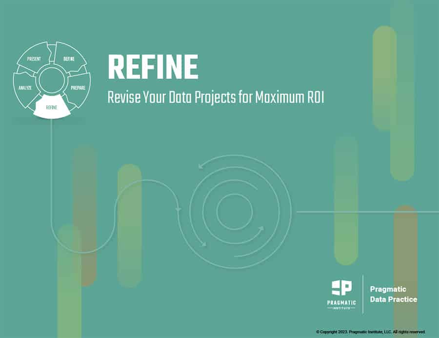
Data analytics can be very powerful when used properly. However, to deliver results for stakeholders and organizations, data practitioners must ensure a project is set up for success before committing the time, labor and resources required for analysis. In this ebook, learn the importance of refining your data project early and having difficult conversations with the project stakeholder based on the data available and the feasibility of the project.
10 Technologies You Need To Build Your Data Pipeline
Many companies realize the benefit of analyzing their data. Yet, they face one major challenge. Moving massive amounts of data from a source to a destination system causes significant wait times and discrepancies. A data...
Python has become the go-to language for data science and machine learning because it offers a wide range of tools for building data pipelines, visualizing data, and creating interactive dashboards that are smart and intuitive. R is...
Hybrid Intelligence: When Artificial or Human Intelligence Isn’t Enough
In an era driven by rapid advancements in AI and automation, the notion of Hybrid Intelligence emerges as a powerful concept. It recognizes that AI and Human Intelligence have significant limitations when used alone. However,...
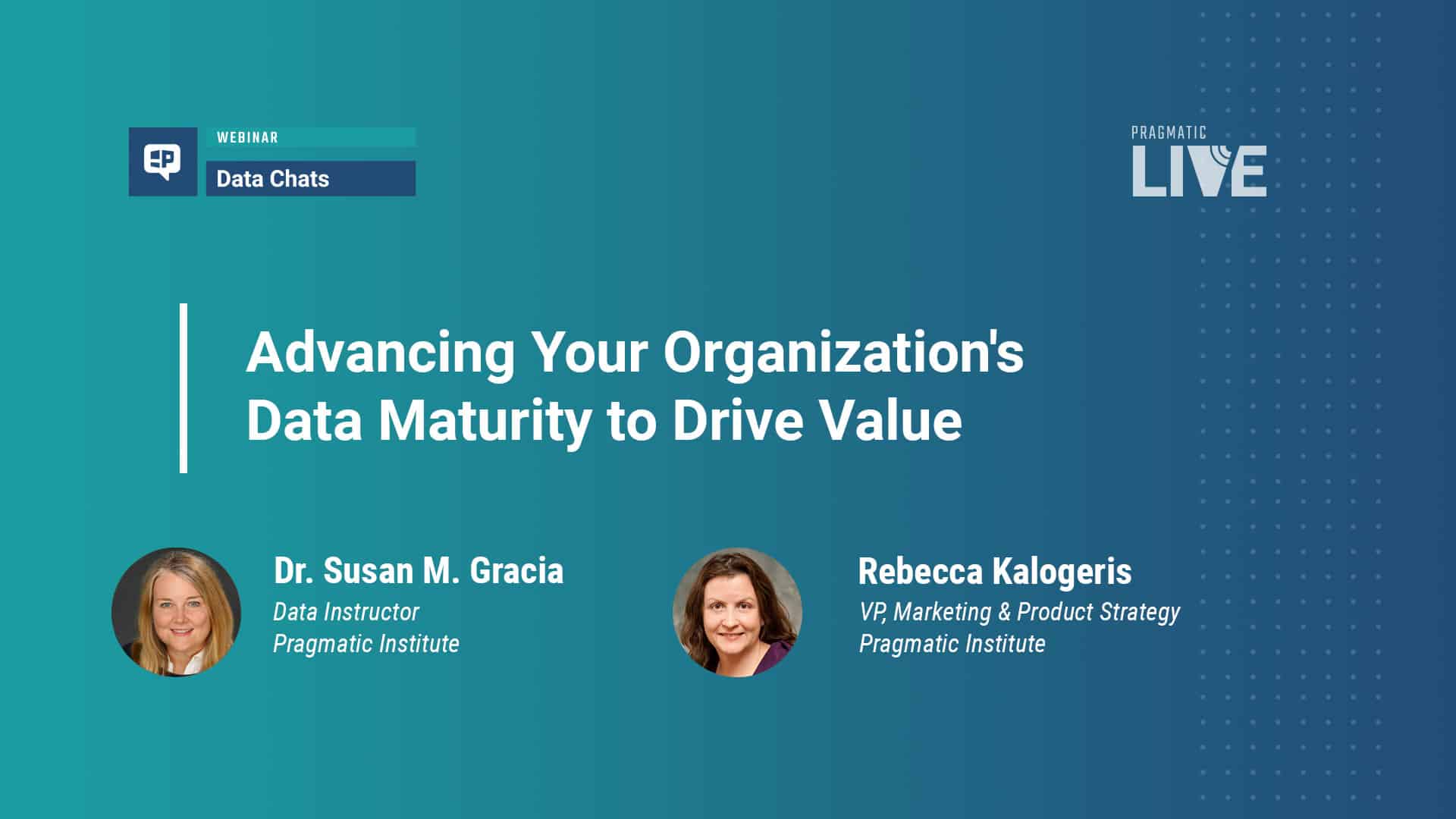
Advancing Your Organization’s Data Maturity to Drive Value
Data maturity is the measure of an organization’s ability to harness the full power of its data and one of its most valuable assets. When an organization is data mature, it can identify new...